.
.
.
.
.
.
.
.
 . . . . . . . . . . . . . . . . . . . .
.
.
 . . . . . .
|
|
|
..... |
Internet
Marketing for High School Teachers
at
Old
Dominion University
LESSON
6

Objectives:
Explain the importance
of Web design in Internet marketing.
Identify the characteristics
of good Web design.
Analyze how marketing
and Web design are integrated.
Additional Essential Readings:
Dr.
T's Web Design Tips Using Netscape Composer
Web Pages that Suck,
ch. 1
Web Pages That Suck,
ch. 2
Web Page That Suck,
pp. 110 - 118
Don't let it fool you. Web page design
is NOT techie; rather it is pure marketing, through and through!
Think about it. When you teach your students about retail, what are some of the things you want
them to know? Merchandising? Layout of the store? Product
selection? Promotion? POP displays? Signage? Ease
of checkout? Customer service? Customer/Employee relations?
Target/niche marketing? Positioning? This list could go on and on.
Now think about a Web based business. Each of these topics we just listed
is determined through Web page design! Good Web page design is
NOT determined by how many flying and singing monkeys move across your
screen doing back flips (and that's a hard one to convince your kids of!).
It is determined by how it creates Web site usability, ease of navigation,
and
aesthetics. They are all important (and aesthetics may rank third
on this list of three!).
teach your students about retail, what are some of the things you want
them to know? Merchandising? Layout of the store? Product
selection? Promotion? POP displays? Signage? Ease
of checkout? Customer service? Customer/Employee relations?
Target/niche marketing? Positioning? This list could go on and on.
Now think about a Web based business. Each of these topics we just listed
is determined through Web page design! Good Web page design is
NOT determined by how many flying and singing monkeys move across your
screen doing back flips (and that's a hard one to convince your kids of!).
It is determined by how it creates Web site usability, ease of navigation,
and
aesthetics. They are all important (and aesthetics may rank third
on this list of three!).
-
A tale of two lawyers. Tell me this
doesn't just SCREAM scads of information about each of these two firms....
AAAGGGHHHH! Are you seeing a slight
image difference here??? What is the Web page design telling you?
We know about Lowell "the Hammer" Stanley, but do you think that Franklin,
Cardwell, and Jones will EVER use this service? The FCJ site has
made an effort to appear conservative, reserved, and very "low key" and
professional (although for my own tastes, the marbled background is a bit
much). The Lynch site has dancing Javascripts, text scrolls, an "injury
helpline" bar on the left that chases you as you scroll down (a reference
to an ambulance would be WAY too easy here), rotating images... You
get--and can SEE--the picture. On a happy note, the Lynch site has
been toned down. There used to be a header about an inch tall that
would constantly rotate CASES, CASES, CASES!
in
animated lettering that would've made "The Hammer" proud.
-
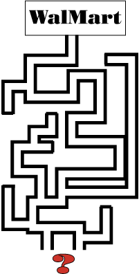
39 percent of test shoppers
failed in their buying attempts because sites were too difficult to navigate.
Imagine what would happen if your bricks and mortar business lost almost
40% of its potential customers because they walked in your store and couldn't
find what they were looking for because your aisles were built in the shape
of a maze? Imagine if Wal-Mart stores were built this way: (Flanders,
Sept. 2000)
You can print out a fantastic Web page
design guideline by going to Dr.
T's web page design tips (Flaherty, 2001)***. One of the foremost
authorities in the nation today on "Marketing on the Internet," I use this
page religiously while teaching this course. Without her help, our
curriculum in Virginia might still be under construction. Using these
guidelines not only might help you with the Marketing principles listed
above, but will also help you to avoid what I call "The T. J. Maxx syndrome."
That is, the "store" looks so sloppy that you don't want to be there, and
you feel that nothing inside can be of any great value. There are
far too many T. J. Maxx's online. Wait until you see some of your
students' first pages...

***See the end of this lesson
for a lesson plan suggestion using Dr. T's tools!
|
.
.
Course
Home | Schedule
| Syllabus
Lesson
1 | Lesson
2 | Lesson
3 | Lesson
4 | Lesson
5
Lesson
6 | Lesson
7 | Lesson
8 | Lesson
9 | Lesson
10
Workshop
| Project
1 | Resources
Contact Mickey Kosloski at mkoslosk@odu.edu
|